Decision 01
How did we design for people using the platform in a difficult moment?
- What we chose
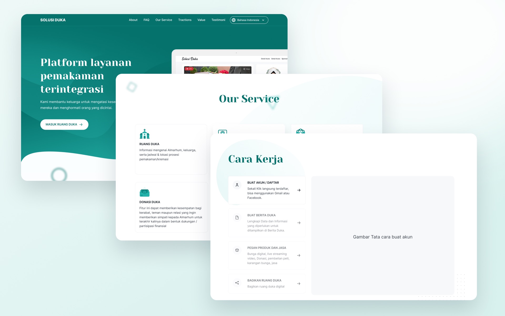
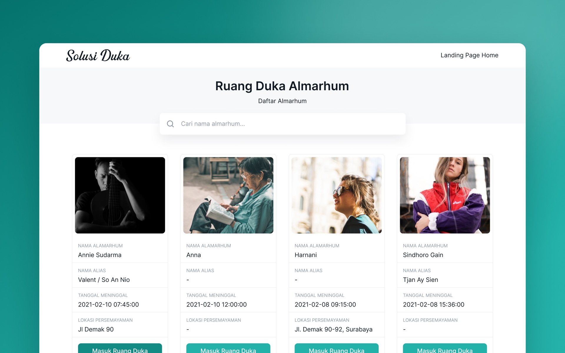
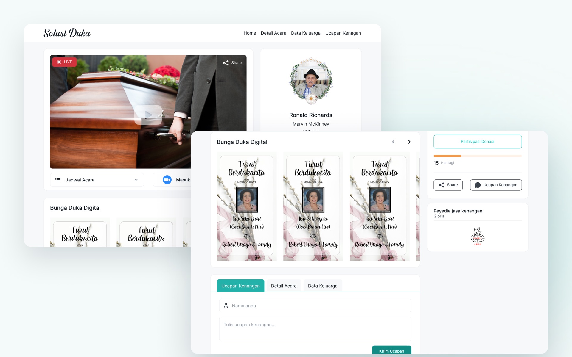
- Calm colours, plain words and as few steps as possible. A family creates one memorial page and shares a single link; guests can join or send a floral tribute without creating an account.
- The trade-off
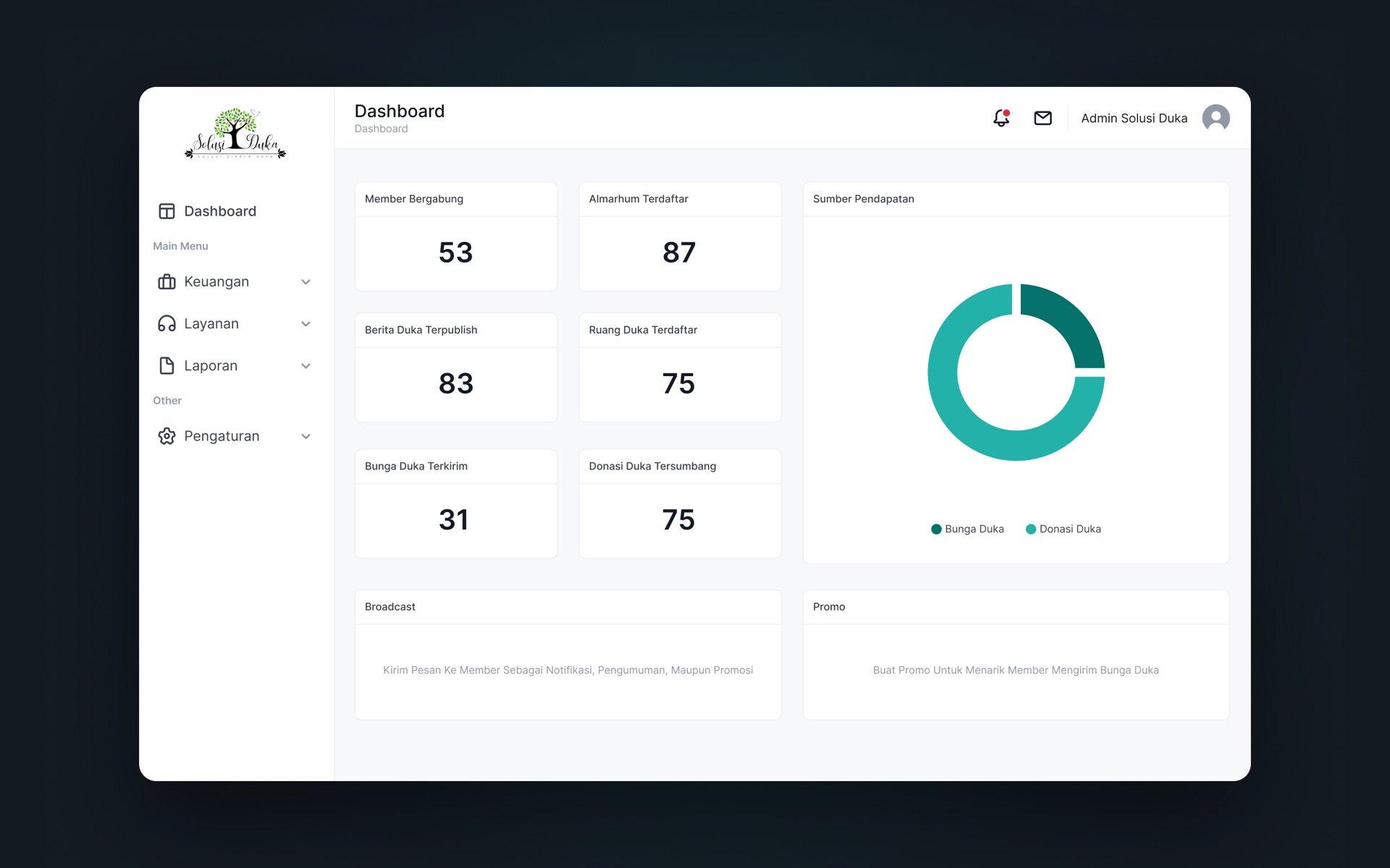
- Fewer choices per screen means some features sit one level deeper, and we left out reminders and promotions that could feel intrusive.